• Jersey Indie
    • About
    • Music
    • Photo/Video
    • Visual and Performing Arts
    • Writers
    • Eat Local | Drink Local
    • Nonprofit Organizations
    • Community-Driven Initiatives
    • Publications and Blogs
    • NJ Map
    • Atlantic County
    • Bergen County
    • Burlington County
    • Camden County
    • Cape May County
    • Cumberland County
    • Essex County
    • Gloucester County
    • Hudson County
    • Hunterdon County
    • Mercer County
    • Middlesex County
    • Monmouth County
    • Morris County
    • Ocean County
    • Passaic County
    • Salem County
    • Somerset County
    • Sussex County
    • Union County
    • Warren County
    • PA Map and Counties
    • NY Map and Counties
    • JI blogger Alex Bradley
    • JI blogger Alex LaVallee
    • JI blogger Deaglan Howlett
    • JI blogger Gregory Burrus
    • JI blogger Lenore Holz
    • JI blogger Luke Morsa
    • JI blogger Nicolas Palermo
    • JI blogger Patricia Rogers
    • JI blogger Sean McCall
    • JI blogger Sonia Schnee
    • JI photographer David Ross Lawn
    • JI photographer Greg Ludwig
  • Contact
Menu

Jersey Indie

Street Address
City, State, Zip
(908) 380-6812
Showcasing NJ/PA/NY's independent artists, small businesses, and creative minds

Your Custom Text Here

Jersey Indie

  • Jersey Indie
  • About
    • About
  • Artists
    • Music
    • Photo/Video
    • Visual and Performing Arts
    • Writers
  • Businesses
    • Eat Local | Drink Local
  • Creative Minds
    • Nonprofit Organizations
    • Community-Driven Initiatives
    • Publications and Blogs
  • Browse by County
    • NJ Map
    • Atlantic County
    • Bergen County
    • Burlington County
    • Camden County
    • Cape May County
    • Cumberland County
    • Essex County
    • Gloucester County
    • Hudson County
    • Hunterdon County
    • Mercer County
    • Middlesex County
    • Monmouth County
    • Morris County
    • Ocean County
    • Passaic County
    • Salem County
    • Somerset County
    • Sussex County
    • Union County
    • Warren County
    • PA Map and Counties
    • NY Map and Counties
  • JI Blog
    • JI blogger Alex Bradley
    • JI blogger Alex LaVallee
    • JI blogger Deaglan Howlett
    • JI blogger Gregory Burrus
    • JI blogger Lenore Holz
    • JI blogger Luke Morsa
    • JI blogger Nicolas Palermo
    • JI blogger Patricia Rogers
    • JI blogger Sean McCall
    • JI blogger Sonia Schnee
    • JI photographer David Ross Lawn
    • JI photographer Greg Ludwig
  • Contact

Interview with Artist Haley Simone

May 1, 2021 Sonia Schnee
9959F723-09AD-4611-A4EE-B26CDCEDFC6B.jpeg

By Nicolas Palermo | Posted Saturday, May 1, 2021

Capturing movement in visual art is not an easy task. The Impressionists did it in their own way with loose brush strokes and an emphasis on soft colors over detail. How does one effectively portray an object in motion to fit their individual style?

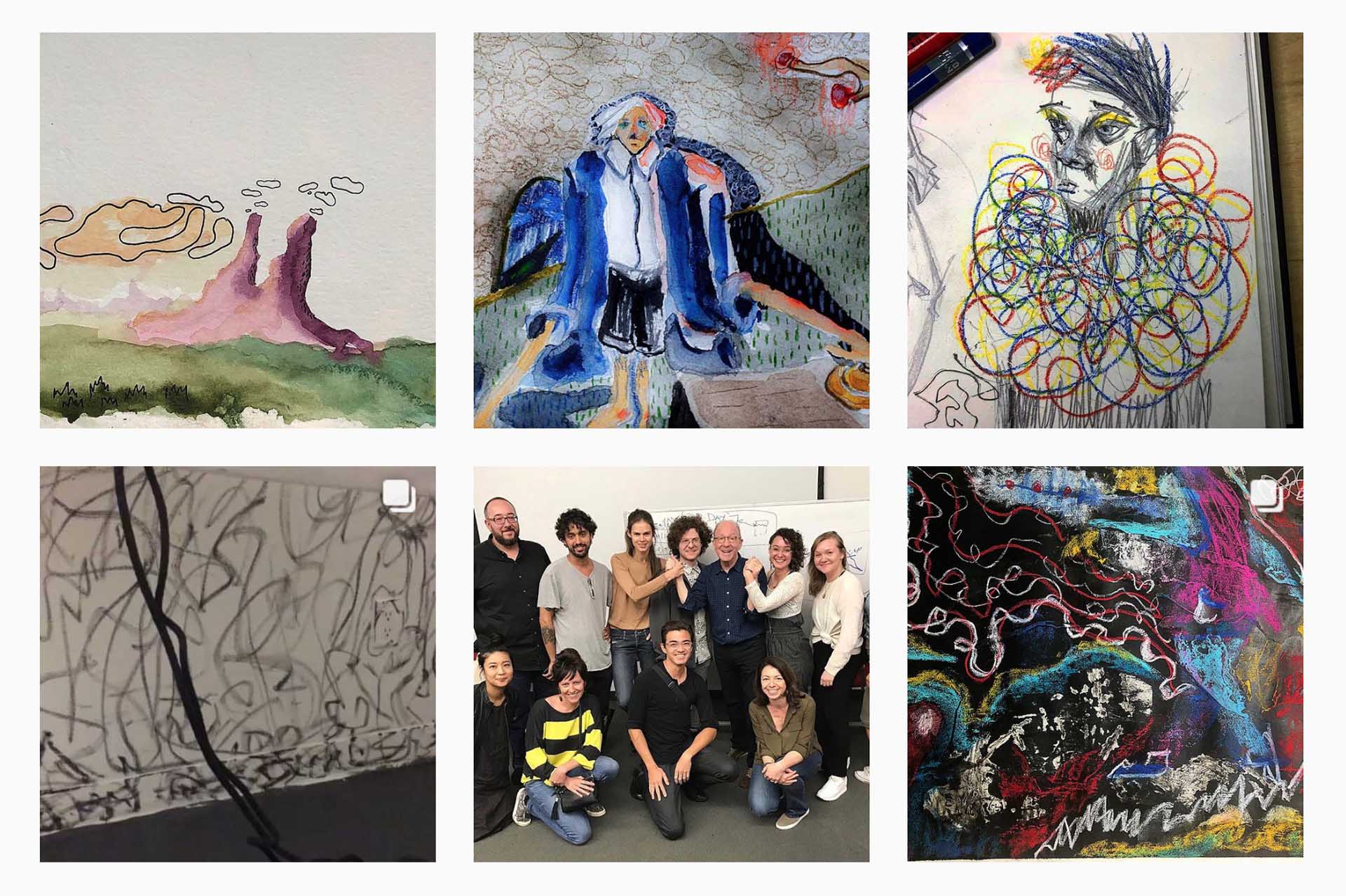
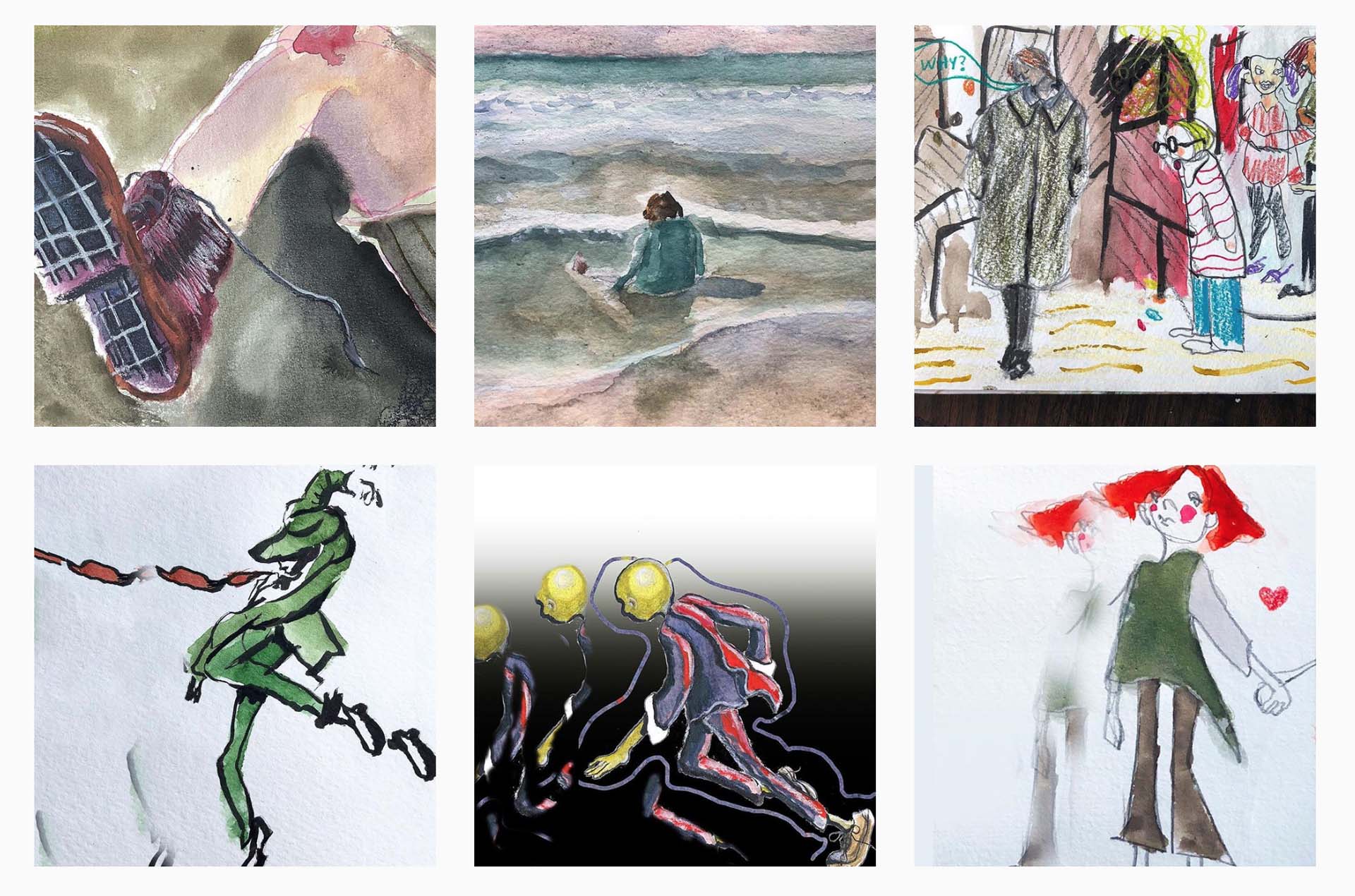
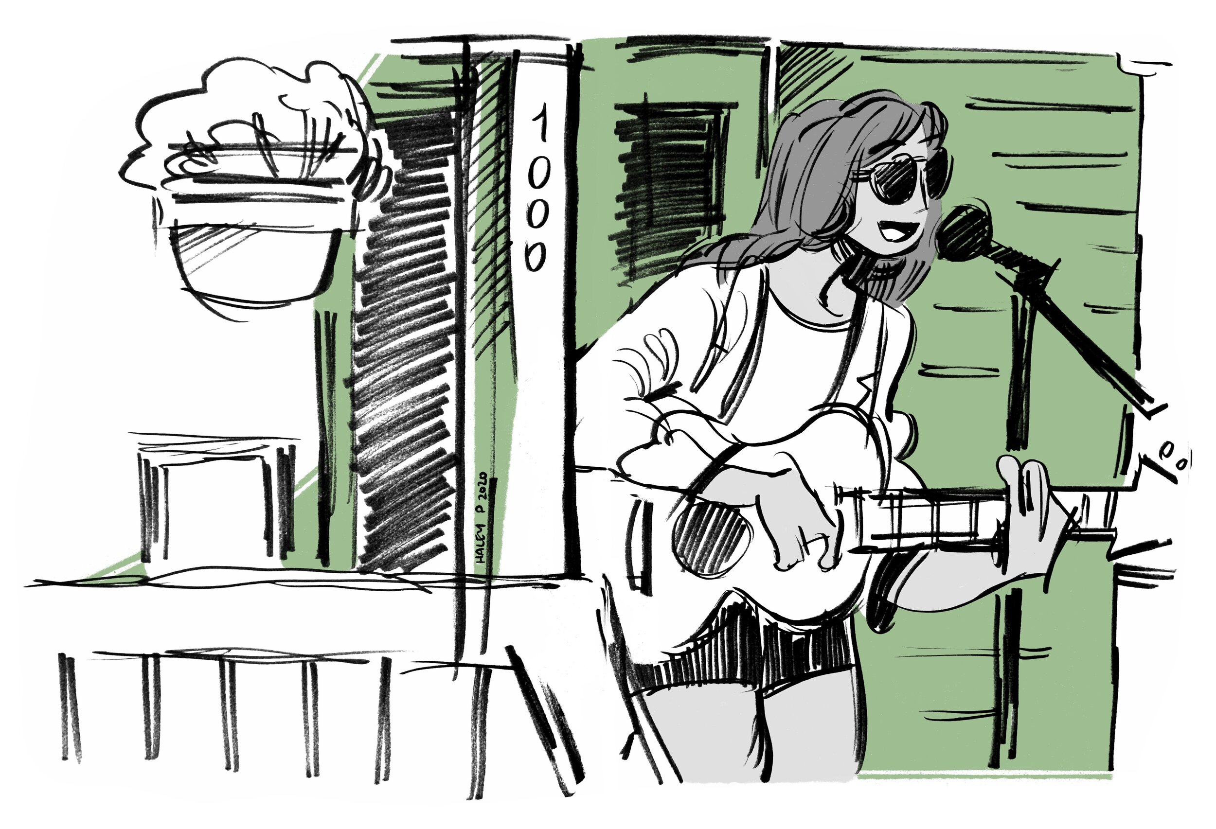
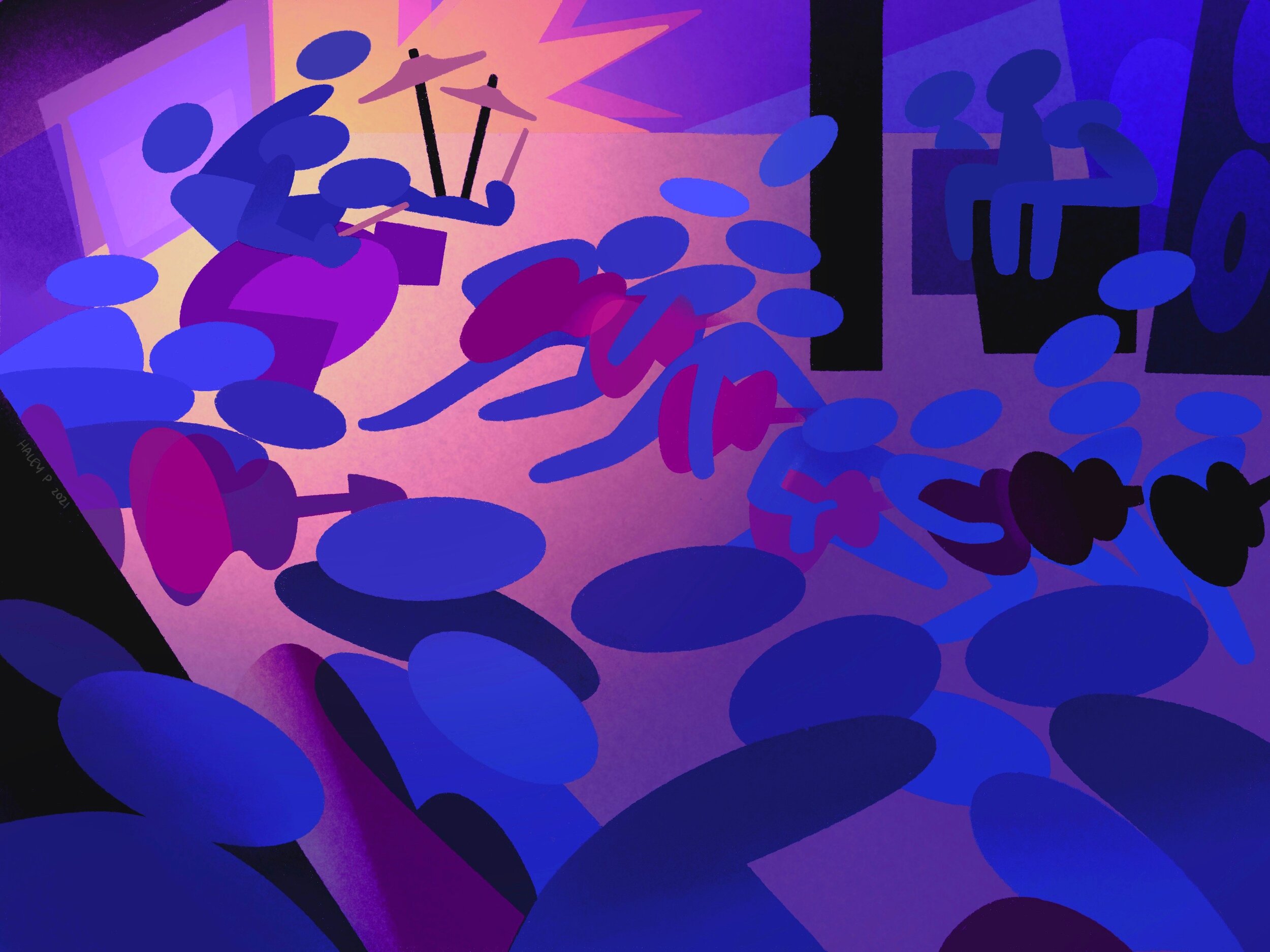
Haley Simone is an illustrator from New Jersey who confronts that question and answers it by effortlessly creating snapshots of musicians on stage as they play live in front of her. Her keen eye for movement is reflected in these on-the-fly illustrations. The line work is free and the colors are inviting. I first saw Haley's work the day after I played a show with my own band. She captured the energy of the gig in a handful of portraits of myself and the other musicians on stage that day. She even got my sideburns on point! The caricatures evoked as much emotion as a photograph from that day would have. Haley Simone draws images of what she sees and our own viewpoints of waking life are enriched by them.

Hi, Haley! Where are you based out of? Do you feel that the area you’re in has an influence on your artwork?

Hey Nic! I’m based out of central New Jersey, not too far from Asbury Park. Living here has definitely introduced me to so many different music scenes — New Brunswick, Asbury, New York, Philly. I spent four years in Brooklyn previously, and had completely fallen in love with it. My work was heavily influenced by living in the city and not much else. So when I had to move back home after school, I was really torn. It was the music scene in New Jersey that really helped me find my place here again. My work followed, and all of a sudden I was documenting everything I could about another place and group of people I loved.

1B167537-7855-47E5-8FBB-27377A9FCDD2.jpeg

I wanted to talk about your live show drawings — I tend to get frustrated when drawing moving things (people, animals etc.) Your illustrations always effortlessly capture the motion and fluidity of a band performing. What’s the process when making these pieces?

Trying to draw something that’s moving is so difficult! Usually by the time you’ve finished drawing a face or a hand the figure is in a completely different position. So I try not to think about it.

The first thing that I do is allow myself to warm up. When you’re drawing a set, you’re lucky if it lasts longer than a half hour, so you want to get a few quick drawings out of the way before it starts. After that, I think the best thing you can do is allow yourself to be in the moment. You’re not trying to capture one pose exactly - you’re capturing the feeling of that moment in time. If the song is angry, let your lines be angry. If the song is soft, let your lines be soft. I only draw in materials I can’t erase — this forces me to make quick decisions. Don’t worry about getting the details right, that will become easier through practice. The most important thing is to allow yourself to record the event as you experience it.

My go-to is the Tombow dual-tip brush pen, which I cannot recommend enough! I take my sketches after a show and scan them into Procreate and edit them, possibly adding some shapes or color. I try to pick
colors that match the feeling of the band.

D930EC8F-9EE9-4829-931E-70C94C5997E8.jpeg

What was your introduction to the NJ music scene? Do you play music yourself?

A few good friends from high school got together and started a band several years back, and on breaks from school I would hang out at practices and travel to shows with them. I actually got into live music drawing specifically because I couldn’t play an instrument, but still wanted to jam with them. By bringing a sketchbook to shows, I get to quietly create alongside so many artists I admire. It’s wild to me that I didn’t think to do this sooner because almost all of the illustrations I’ve ever made has an album or two that I blasted continuously while making it. I am trying to learn the guitar, though. It's really hard.

3F408905-3D19-4E56-8C3B-CCD30F4F3A74.jpeg

The playfulness in your artwork reminds me of an aesthetic of cartoons and comics from our childhood (Cartoon Network, Scott Pilgrim etc.) It brings me back to a time when I’d hangout at bookstores and read comics without ever actually buying them (I was just a kid!) Who are your biggest artistic influences?

Oh boy, there are so many. Here is a painfully brief list.

Comics: Reading Mike Mignola’s “Hellboy” made me want to draw comics. His pacing and storytelling are incredible, and what has always amazed me about his work is his ability to make the space between each panel a moment in itself. I was introduced to the work of Ron Wimberly and Charles Burns in college, and their usage of the medium blew my mind. Newspaper comics have always been a source of comfort for me too —
I’ve been reading Gary Larson’s “The Far Side” and Patrick McDonnell’s “Mutts” since I was a kid.

Illustration: Phil Hale and Greg Manchess are two of my favorite painters when I’m looking for guidance on brushstrokes and lighting. Maurice Noble created many of the backgrounds for Looney Tunes, and
his usage of shapes and color schemes are such an influence on me when I’m making stuff.

Animation: Thurop Van Orman’s “The Marvelous Misadventures of Flapjack” was that incredible realization that animation didn’t have to be one thing — it had hand-drawn animation, stop motion, cut-paper. Everything. Watching that show along with Laika films like ParaNorman made me want to learn how to create stop motion. Patrick McHale’s “Over the Garden Wall” inspired me to learn storyboarding
and digital painting. I still remember the first time I experienced Redline, directed by Takeshi Koike. That movie just made me want to draw better.

Recently, I’ve been admiring the work of Dedouze, who has completely revolutionized the use of Grease Pencil in Blender. I also just finished watching the anime adaptation of Koyoharu Gotouge’s “Demon Slayer” — the art style and usage of 3D animation was amazing. I love drawing to Screaming Females, Murder by Death, and MF DOOM.

D9985722-28BA-4F47-8A12-FF92F5928833.jpeg

Are you working on any projects right now that you’re excited about?

For the first time ever, a lot of my projects are actually under wraps right now — but I am looking to take on some new commissions in the next few months!

As for personal work, I am working on a series of illustrations for fun about a bunch of little demons who hijack and steal a car from a used car dealership. I can’t wait to share them.

Where can we follow you and find your artwork?

Thanks so much for having me!

My music-based website is www.haleydrawsmusic.com. You can follow my work on Instagram @haleydrawsmusic!

Tags Haley Simone, Illustrator, Music Illustration, Live Music Drawing, Central Jersey, Nic Palermo

Interview with Artist Logan Stahl

March 4, 2021 Sonia Schnee
tomb_world.jpg
raleigh.jpg
barter.jpg
DAY15.jpg
tomb_world.jpg raleigh.jpg barter.jpg DAY15.jpg

By Nicolas Palermo | Posted Thursday, March 4, 2021

In her book What it Is, underground comics legend Lynda Barry explains that fantasy worlds in art aren’t created to escape reality. Rather, their existence helps us to stay in reality. To bear it. “We have always done this; used images to stand and understand what otherwise would be intolerable.”

Logan Stahl is an illustrator from NJ whose images help me do just that. The sci-fi inspired worlds that his characters inhabit portray, but are not limited to: scenes of warriors battling insect-like beasts, buildings that somehow look both ancient and futuristic and nomads trudging through seemingly endless deserts (are they escaping something or just wandering to feel alive?) Logan takes hints from comic book and manga greats that many of us deeply admire, but his style is still distinctly his own.

Hi Logan! How are things?

Logan Stahl: Hey, thanks for reaching out! I’m doing pretty well, all things considered.

Where are you currently based out of?

I live in Somerville, NJ.

What are your favorite mediums to work in?

I primarily work with felt-tipped pens for linework and photoshop for colors. They’re what I have the most experience using and they’re both cheap, quick, and clean to use. I regularly work with markers and colored pencils as well, and for a while I was taking oil painting classes until COVID got in the way. In general, I enjoy working in any medium, but I’m usually limited in my choices by time, money, and desk space haha.

You mention in your Patreon account bio that you are “hugely influenced by Moebius, Otomo, Wayne Barlowe and Miyazaki.” When I look at your work, I see these influences coming through — especially in the way your characters interact and in the colors and shading. How did you initially discover these artists? What works by them had the biggest impact on your style?

Wayne Barlowe I found first. I had An Alphabet of Dinosaurs as a kid, and I still think it’s one of the most superb collections of paleoart ever produced. I also had Barlowe’s Guide to Extraterrestrials and Expedition. Everything he does is just perfect — he brings the gravitasand drama of an artist like Thomas Cole or Jean-Léon Gérôme to illustrations of aliens and demons and dinosaurs. I never get tired of going back through his books.

Otomo I discovered in my tail end of high school — I think Akira was the first anime I ever actively sought out to watch and I was blown away. I tracked down the manga soon after that and devoured it. I find his art almost intimidating — the soaring cityscapes and labyrinthine industrial depths his characters inhabit are daunting in their scale and complexity, and no details are ever sacrificed for convenience or simplicity in his work.

Moebius I found my freshman year of college, around the time I started drawing seriously. For quite a while I didn’t know anything about him or his comics — I just kept finding more and more drawings by him on the internet, each one more evocative and bizarre than the last. The color, the linework, the designs — all of it enchanted me and still does. He’s definitely the artist I’ve spent the most time trying to emulate.

Miyazaki I discovered when one of my best friends brought over a DVD of Nausicaä of the Valley of the Wind. Nausicaä to me is just perfect — I couldn’t ask for anything more in a story. In style it’s like a pastiche of all the 60s/70s/80s sci-fi / fantasy novels I grew up reading and in substance it’s pretty darn heavy. Over the years I’ve been working my way through the rest of the Ghibli canon, but Nausicaä will always be my favorite. Fun fact: Moebius actually named his daughter Nausicaä, after Miyazaki’s titular princess, and Miyazki has said he “directed Nausicaa under Moebius’s influence.”

Your bio also mentions that you’ve been published in “RPG zines.” The hands-on, DIY process of making zines is so crucial to the foundations of underground art and music scenes. I love that they’re still prevalent today. With that being said, I’ve never heard of that specific kind of zine. What exactly is an RPG zine? How did your collaborations with these RPG zine-makers come about?

Well, you’re in good company because I hadn’t heard of RPG zines either before I started working on them haha. The gist of it is this: RPG zines are fan-made supplements for tabletop role-playing games (“TTRPG”s or “RPG”s), such as Dungeons & Dragons. Usually they’ll contain homebrewed settings, adventures, or gameplay rules and they’re pretty short in length. The first art commission I ever did was when someone online reached out to me to ask if I could illustrate a zine for them. Since then my work has been featured in a few relatively successful zines, and I guess my name’s been spreading through the RPG community because I’ve had pretty steady work doing those kinds of illustrations for the last year or so. I myself don’t play TTRPGs too often (from a lack of experience and time, not from a lack of interest or enjoyment), but I’ve gotten to meet a lot of really cool people doing this kind of work!

Also, to respond to what you said about art and music zines — I would love to work on more stuff like that. I’m really into the Jersey DIY music scene and I actually did cover art for a split EP between a couple local bands a few years back but unfortunately nothing more since that.

What is your favorite part about your artistic process?

I love being able to visually represent something that started out as an idea in my head. It’s incredibly satisfying to look down at a piece of paper and see a picture of something that I had only imagined before. It’s the same thing that’s kept me drawing since I was a kid and it never gets old.

Do you have a favorite project or piece in recent memory that you’d like to talk about?

From 2018 to late 2020, I wrote and illustrated a sci-fi / fantasy book written in the form of a travel journal. It’s called Coelum and I put a lot of love and effort into it. The art and writing is all complete, I’m just working with my publisher to actually put it out there, so hopefully that should be available digitally in about a month or so and, if everything goes according to plan, we want to do a physical release at some point as well. Aside from that, I’m currently working on an RPG zine called Desert Moon of Karth written by Joel Hines that’s all about space cowboys and aliens slugging it out on a desert planet. It’s delightful to illustrate and it made over 40 times its funding goal on Kickstarter, so that’s something to check out if you get a chance. Heavily inspired by Dune, Cowboy Bebop and Edgar Rice Burroughs’ Barsoom books — all stuff that I love dearly.

What are you working on now? Where can we follow you and find your art?

Right now in addition to Karth I’m working on more RPG zines and lots of smaller commissions here and there and that’s probably going to take up most of my time over the next couple months. I’ve also been working a bit on a collaborative book with a few of my friends who are also illustrators. It’s going to be a faux buyer’s guide to space mercenaries, with each of us designing and illustrating a bunch of sci-fi bounty hunters and writing up stories for them. That’s kind of on hold at the moment as we’ve all been (fortunately!) busy with commissions, but it’s something I look forward to getting back to down the line.

If you want, you can follow me on twitter, Instagram, or Tumblr:
https://twitter.com/Lil_Tachyon
https://www.instagram.com/liltachyon/
https://lil-tachyon.tumblr.com/

Thank you so much for speaking to me, it’s been a pleasure!

Tags Illustrator, Visual Artist, Logan Stahl, Somerville, Somerset County, Nic Palermo

Interview with Connor Bradley (Artist)

May 16, 2019 Sonia Schnee
Connor Bradley.jpg
Connor Bradley t-shirt 1.jpg
Connor Bradley t-shirt 2.jpg
Connor Bradley.jpg Connor Bradley t-shirt 1.jpg Connor Bradley t-shirt 2.jpg

By Nicolas Palermo | Posted Thursday, May 16, 2019

Bootleg items — whether it be clothes, jewelry, or accessories — often have an alluring aura to them. Take for example, a bootleg Grateful Dead t-shirt: it may not be “official”, but it has an individual personality that cannot be found in mass-produced, licensed merchandise. Therein lies the paradox of the “bootleg” — it is supposedly “inauthentic,” but in reality, it holds a unique quality given to it by the artist behind the graphic.

With that being said, some people are more fascinated with brand-authenticity and bootleg culture than others. Connor Bradley, a NJ-raised, Philadelphia-based artist and designer is one of these people. His latest brainchild is Cold Beer & Soda, a brand that promises “Fresh Quality Guaranteed.” Using his past experience with t-shirt designing/printing, Connor is putting out product that takes influence from hand-painted signage — an artform that is authentic as it gets.

So grab a lawn chair and kick back with your favorite chilled beverage and familiarize yourself with Connor Bradley and his latest project, Cold Beer & Soda. Fresh quality, indeed.

Where did you grow up and where do you currently live? Do you feel as if your environment has had an influence on the style of your artwork?

I grew up in Howell, NJ which is located in Monmouth County but currently live in Philadelphia, where I go to school. I feel like my change of environment has definitely influenced the things that I am currently doing and working on. When I was younger, growing up in a town that has farms and is very rural I was always influenced by the city lifestyle I saw in rap videos, skate videos, and on streetwear blogs. I followed a lot of blogs on Tumblr and Instagram pages that were taking photos of things that were happening in the city centered around streetwear, and I thought that was the coolest stuff in the entire world, and I wanted to be there and have that, but I couldn’t where I was located.

So the first chance I got to go to a city I jumped on and that’s here in Philadelphia. So now being in the city, and having the chance to meet other creatives who like the same stuff as me, and going to events like the ones I was seeing on the internet as a kid is really cool and inspiring to me at the moment. It’s great to actually be able to have fun like what I was seeing as a young kid. Being able to bounce ideas off of people and just talking about clothes, music, culture and having inspiring conversations with people is a great change of pace for me.

Your latest creative output, Cold Beer and Soda represents the East coast aesthetic so well. What is the overall theme or concept of the brand? What are your inspirations for the images you chose to use on the first run of CB&S tees?

Well that goes back to the blogs I spoke about earlier. Store fronts and hand signage are always something that I’ve loved to look at. So it comes from that a lot. I love looking at signs because they are all unique and they are really the first impression you get of a business when walking in the city. We didn’t have that by me growing up, we just had commercial stores that are so in your face with branding and that sort of stuff. It really gives me the opportunity to be creative when making and designing the graphics. It allows me to be funny with a slogan for a business, use some funny clip art that looks cheesy but at the same time fits the pieces. But mainly the aesthetic is funny souvenir t-shirts, or employee t-shirts for businesses. In the first collection I did a “Bootleg Emporium” tee that in a way is a homage to the bootlegs I have been making for the last 4-5 years. And of course the Moon Motel is a super legendary sign in my hometown that was out in front of a super run down motel that was really out of place for our area. And that kind of has its own aura to that.

I’ve been following your Instagram for a few years now and I can see that the Grateful Dead and Phish have had a massive influence on your lifestyle. When you first started making t-shirts, many of them were Dead bootlegs? What made you want to transition from Dead boots to starting your own brand? What did you learn from your early days of making and selling shirts?

I love Dead Bootlegs and they will forever hold a place in my heart but they don’t have longevity. It’s something that I like to do for fun and a hobby that allows me to buy ticket to see them. Cold Beer & Soda allows me to be more serious about my creative set and work on things that are out of the norm from what people usually see from me. It’s starting completely over from scratch again and that’s the fun for me. It really challenges me everyday when I sit down and think about it because I forget how slow of a process it is to build something from nothing. I’m very grateful that I started doing this early on in life and I have the experience that I do and can kind of navigate myself around some of the beginning stumbling blocks. So if I’ve learned anything, it’s definitely to be patient, and relax.

Are there any clothing brands or visual artists that you feel like we should know about?

Rather than a specific brand/person, I’d like to talk about the creative energy in Philadelphia right now. There are so many special things happening here right now, and I’m so excited to be able to toss my hat in the ring among this group of people who inspire me and push me out of my comfort zone. Everybody builds each other up, no competition and wanting to get over on someone. At first I was nervous being the outsider but everyone here has been so welcoming and encouraging. I wouldn’t have made the steps to start something new without these people.

We are all looking out for one another and supporting each other.

I’ll provide you with a list of some Instagram handles you should get familiar with:

@SaeedFerguson
@PsQsShop
@KyNCao
@Fran_e_Pac
@ParatodoCo
@AllCapsStudio
@JayIveyLeague
@CamronBooth
@SeannMurray
@nick.massarelli
@imoutfront
@helloyowie

Any cool stories or experiences from going to concerts for so many years that stand out?

There are many. But out of everything, it’s building up my family that I go to shows with. When I first started going to shows, I was going with a lot of older heads and they took me in and showed me the ropes of everything. I eventually started forming my steady group of friends and that’s the best thing that has ever happened to my life. We talk every second of everyday, I love them a lot. You get to meet so many amazing people from different backgrounds through this community and it humbles you and makes you grow everyday.

Thanks so much for taking the time to talk! Where can we follow you and see your latest Work?

Thank you for the opportunity!!!!!!!!

@ColdBeerAndSoda on Instagram.
@ConnorABradley for my compulsive updates and statistics about Phish :)

Tags Howell, Monmouth County, Philadelphia, Visual Artist, Connor Bradley, Nic Palermo

Interview with Chris Raia (Multimedia Artist)

December 21, 2018 Sonia Schnee
Chris Raia artwork on Instagram 10.jpg
Chris Raia artwork on Instagram 7.jpg
Chris Raia artwork on Instagram 6.jpg
Chris Raia artwork on Instagram 4.jpg
Chris Raia artwork on Instagram 3.jpg
Chris Raia artwork on Instagram 2.jpg
Chris Raia artwork on Instagram 1.jpg
Chris Raia artwork on Instagram 10.jpg Chris Raia artwork on Instagram 7.jpg Chris Raia artwork on Instagram 6.jpg Chris Raia artwork on Instagram 4.jpg Chris Raia artwork on Instagram 3.jpg Chris Raia artwork on Instagram 2.jpg Chris Raia artwork on Instagram 1.jpg

All artwork property of Chris Raia. See more of Chris’s work at christopher.raia.art and christopher-raia-art.com.

By Nicolas Palermo | Posted Friday, December 21, 2018

Chris Raia is a visual artist from Freehold, NJ. By working in different mediums, Chris doesn’t allow himself to get boxed into one specific style. The subject matter of his work has a wide range as well. Taking influence from his favorite animators, he creates anything from still life charcoal drawings to abstract paintings. I spoke to Chris to learn more about his techniques and artistic influences.

The medium you choose to work with varies from one piece to the next (charcoal, watercolor, graphite, etc.). Do you have a favorite? How do you decide which medium you are going to use for the project at hand?

When it comes to a favorite, I’ve definitely been bouncing around, but ever since I  touched Watercolors a couple of years ago I’ve been hooked. I love how it naturally makes marks that are organic and gestural. When it comes to choosing a media, it often feels impulsive. I, of course, try to think about materiality and what using a certain medium over another may suggest, but sometimes being overly analytical can inhibit me from making art at all.

Do your portrait illustrations and paintings come from real life or your imagination?

Both. I think that to be able to draw from your head, you first have to draw from life so that you can build a vocabulary of visual information. It’s important to know the rules before you can effectively break them in your own work. If I don’t know what to draw then just I study what’s around me.

Another thing that stood out to me about your artwork is that you don’t stick to one particular style. It ranges from minimalist doodles to more complex and experimental oil paintings. Is it a conscious decision to create work that ranges in style from piece to piece or does it just turn out that way depending on your mood/mental state/emotions?

I think I bounce around a lot because I am somewhat indecisive and just want to learn everything. I think artists feel a pressure to quickly develop a brand that is easy to package and sell to an audience. Not to say that I won’t eventually have a more singular practice, but I think that artists owe it to themselves to take their time with finding their voice.

Who are some artists that you are influenced by? Do you attempt to drop hints of their work into your own art?

There’s a billion haha, but right now, I have been focusing on a lot of animators. Max Fleischer, Lillian Friedman Astor, Don Hertzfeldt, Pat McHale, Kazuo Oga, Satoshi Kon,  and Alexander Gellner to name a few favorites. I don’t think I intentionally drop hints of them in my work, but I think they always seep through. It’s actually most exciting when people tell me that my work reminds them of an artist that I’ve never even heard of. It’s always great to discover artists who care about the same ideas that I do.

Where can we find your artwork and follow you online?

I am on instagram at christopher.raia.art and my website is christopher-raia-art.com!

In The Arts Tags Nic Palermo, Visual Arts, Visual Artist, Graphic Artist, Freehold, Monmouth County

Interview with Illustrator Keith Glidewell

October 17, 2018 Sonia Schnee
Keith Glidewell Ditz CrudWeiser.jpg
Keith Glidewell smoking house.jpg
Keith Glidewell Ditz CrudWeiser.jpg Keith Glidewell smoking house.jpg

Artwork by Keith Glidewell

By Nicolas Palermo | Posted Wednesday, October 17, 2018 

From the Andy Warhol/Velvet Underground collaborations of the 60s to RISD alumni Talking Heads, to the anime-inspired characters that make up Gorillaz, visual art has been almost if not equally important to the history of music as the music itself.

Take NJ native Keith Glidewell, for example. When he isn’t noodling bass riffs for the emo/punk group Ditz, he’s doodling exaggerated, whacked out cartoons that you could easily imagine on your favorite Adult Swim show. Although still images, the facial expressions and body language of his characters give them an animated quality. Some of them might even reach out to hand you a beer. Many of these doodles become finished products that adorn the album covers and fliers for his own band.

I spoke to Keith to learn about the creative process and inspiration behind his work.

Where did you grow up? Do you feel like the area you live in and your experiences there have had an effect on your artwork?

I grew up in Florence, NJ which is a small, blue-collar town in Central Jersey—right on the Delaware River. When I say that Florence is small, I'm not exaggerating; I graduated with 97 kids. Most people are shocked when I tell them that, but I thought it ruled. Everyone knew each other and that was super humbling. For the most part, there weren't social cliques and this allowed me to get to know people on a personal level that I wouldn't have otherwise. I was exposed to many different cultures and ways of thinking. On top of that, I had a really, really great group of friends (that I'm still friends with today), and we spent most of our time building forts down by the river, playing "office chair hockey," and hanging out in cardboard dumpsters at the middle school. I think the area that I grew up in and the experiences I had there absolutely has an effect on my artwork. Florence gave me a good look at people and what it means to be human, and I try to reflect that in my characters. 

What is the process for making your doodles turn into album covers or show fliers?

I kind of stumbled into making artwork for bands and as a result, stumbled into being in a band myself. I had been posting character designs and doodles on Instagram for a while and, although a few people commissioned me to do design work for them, I was mostly doing it for fun. One day my buddy Todd asked me to come up with a logo for his new band, Ditz, and he sent me the demos to listen to while I worked on it. He also let me know that they were looking for a bass player. The design took a few days and the band loved it, and I ended up liking the demos so much that I tried out for the bass part. Now I play bass in Ditz and handle the design work which has been extremely rewarding.  I was always a huge fan of James Heimer's illustrations and how he branded The Wonder Years' early stuff. He had such a distinct style, and that's something I try to accomplish with Ditz.

Your characters appear cute and goofy at first but many of them seem to have very “human” qualities to them (i.e. smoking cigarettes, partying, being violent). Is this a style that’s influenced by any artists in particular? Do you give your drawings a hidden darker quality consciously or is that just how they end up?

My work has always been pretty gross! In high school, my math notebook was filled with drawings of people vomiting or smoking giant cigs or giant cigs vomiting up people. I think that gross-ness stems from me being obsessed with shows like The Marvelous Misadventures of Flapjack, Superjail!, Spongebob, and Courage, The Cowardly Dog. As I grew up, I got into R. Crumb and I really dig all of his characters and their exaggerated features. All of these shows and artists influenced me greatly and I take a little bit from each one. I always appreciated the fusion of innocence and the sad/gross parts of being human. Characters can be both charming and disgusting and that's something I like to highlight in my artwork. 

In addition to drawing, you have a talent for animating. How do you bring your doodles to life? What is the process for making animated cartoons? 

I didn't consider animation as something I'd like to do until my uncle, cartoonist Mark Tatulli, told me that I had the potential to do it. So, I picked up a few animation classes at TCNJ and fell in love with it. I'm interested in 2D, frame by frame animation and I have this overly complicated process (that involves drafting, inking, and coloring in one app and then editing the frames together in another), but it works for me.  As much as I love animation, I like to stick to pre-production like storyboarding and character designing! 

What projects do you have planned next as far as visual art goes? What about in music? 

Well, artistically, since I JUST graduated college, I've been doing personal work. Doodles and gross characters— things like that. I'm going to start posting on Instagram daily again, and I'm excited. My senior year made it hard to do that and I can't wait to get back. I also have been working on a few short films and music videos, which is another passion of mine. Musically, Ditz has been writing a full-length record, smoking cigs, drinking a bunch of beer, and playing shows. We're going to keep doing that!  

What accounts could we follow you at for updates on any new art or music?

My instagram account is: @keithglidewell where I post drawings, film stuff that I'm doing, and pictures of my big dumb head. The Ditz account is: @ditztheband. This is where we post show dates, video clips we have, and pictures of our big dumb heads. 

Tags Nic Palermo, Visual Artist, Illustrator, Florence, Burlington County

Interview with Artist Lucie Mullen

June 4, 2018 Sonia Schnee
Lucie Mullen artwork.jpg

By Nicolas Palermo | Posted Monday, June 4, 2018

Lucie Mullen is a graphic artist from Middletown, NJ whose work has an animated quality -- both in a stylistic and literal sense.  Drawing inspiration from the movements and techniques of skateboarding, Lucie brings her doodles and tattoo flash-inspired illustrations to life by creating short animated clips that adorn her Instagram profile.

Don’t get it twisted, though -- Lucie is not limited to animation.  T-shirt designs, skateboard graphics, album covers, and posters are only a handful of projects that Lucie has tackled in the past few years.  Common motifs utilized but not limited to: smiling animals, tropical fruits, bones, teeth, and clinking beer bottles.  Ultimately, Lucie’s work exemplifies what many of us often forget is at the core of why we make art: it is limitlessly fun.

Where are you located in NJ?  Do you feel that the area you grew up in has had an effect on your artwork?

I grew up in Middletown.  Being close to the city and the shore is pretty sweet.  I have a few friends that have definitely inspired me to pursue my art as more of a career than a hobby.  Also, being so able to visit the city so often has been a huge inspiration.  I lived in Brooklyn for a summer and was around so many talented artists.  That definitely lit a fire under me at a young age and helped me see that my goals as an artist weren’t unachievable.

I think your use of clean lines and playful color schemes give your art an inviting personality, even if there are no words there to welcome us in.  Is it a conscious decision to create work that is not text-heavy?  Do the icons and little characters hold personal meaning, or are they created out of spontaneity?

Thank you!  I’ve always liked leaving my drawings super open-ended so that anyone could relate to them in any way they choose to.  They are definitely created spontaneously.  Most of the time when I come up with ideas they’re from me sitting around with my sketchbook and thinking of silly stuff that would be fun to draw.  I get a lot of inspiration sometimes from flash tattoo sheets, but I like to create my own spin on designs.

I wanted to talk about your animations.  Is animation a new realm of creating art for you?  What is the process like when making your illustrations come to life?

I learned how to make frame by frame photoshop animations a few years ago.  I put that aside as I really enjoyed just drawing with pencils and pens for a while.  But as of recently, I started to realize the great versatility in animation as a tool for my art.  Being able to make my drawings come to life and change color or explode within seconds has really opened up a new door for me.  They are also so fun to make.  I usually start the same way I do with most of my artwork, by making a bunch of doodles on a page and then thinking about ways they could transform.

I also like to take videos of my friends skating and draw over them to create a new kind of world they’re skating in.  It helps me get better at fluid motion in my animations, and my friends are always hyped on them!

How did your collaboration with Portugal. The Man come to fruition?

I’ve been in love with Portugal. The Man’s music for about 8 years now, so this whole experience has been an amazing ride so far for me.  In December, the Portugal. The Man instagram page started following me (as they did with a bunch of fans back then) and liked a few of my posts on my page.  John Gourley, their lead singer, runs the account.  He is really fantastic at fan interactions on social media.  I direct messaged the account and said I am a huge fan and would love to work for them in some way.  John immediately got in touch with me and was so positive and open to us working together.  Months later, he called me and told me about some ideas he had for animations for their shows.

A few days before their Coachella, I was asked to do some animation loops for their show.  I basically dropped everything (classes/going outside at all) to get my work in on time.  It was crazy seeing my animations on that huge screen, and I’m really excited to keep working with them in the future.  They are the kindest coolest band, and I’m so lucky to have had the opportunities that they gave me.

One thing I notice so often with artists in New Jersey is the importance of merging skateboard culture and visual art.  What is your background with skating?  Are there any skaters that influence you not only to skate but pick up a pencil?

I started skateboarding when I was 9-years-old.  I dropped it for a while as it was hard for me being the only girl out there.  Thankfully, I picked it back up in college and have made so many great friends from it.  Since skateboarding is another hobby that I truly enjoy, I love incorporating it into my artwork.  Art and skateboarding have been coexisting forever.  I’m always excited to see my friends creating new zines or video premieres because I know they are very passionate about their work.  I love the artwork from the skaters/artists Geoff Mcfetridge, Ed Templeton and Mark Gonzales.  They are huge inspirations to me.  Some instagram skater/artists that I also love are @funeralfrench, @cosme and @eloweeese.

Where can we find and follow your work online?

Instagram is my favorite place to post new work -- @lucidmullet.

My website is www.luciemullen.com.

Tags Nic Palermo, Middletown, Graphic Artist, Monmouth County

Interview with Artist Jill Carlock

May 25, 2018 Sonia Schnee
Jill Carlock art.JPG

By Nicolas Palermo | Posted Friday, May 25, 2018 

By painting images inspired by the reflections of light on objects, New Jersey-based painter Jill Carlock creates works that are not necessarily representational or non-objective.  Many of the outlines for the paintings come from shapes created by the light-reflections, but the radiant embellishments that layer over the outlines are purely from Jill’s imagination.  

The tropical colors Jill chooses to use coexist in harmony with the patterns and brush strokes to create a sense of rhythm.  But Jill’s paintings don’t all move to the same beat, as evident in the variations in forms and hues from one work to the next.  White paint is used sparingly, but its presence in the composition should not be ignored.

Like the very light that is the inspiration behind so many of Jill Carlock’s pieces, her work shines with energy, evoking memories of being a kid and seeing the colorful shapes that dance behind closed eyelids as you lay down in the sun.

Tell us a little about where you are from in NJ.  Do you enjoy living in that area?  Do you feel like living there has had an effect on your artwork?

I'm from Middletown, right in the center of the state near all the good beach stuff!  It was a really solid place to grow up, mainly because there were so many things to do.  Living here has influenced my work in terms of customizing surfboards and pretty much whatever I could get my hands on.  Driving down the street to a complete view of the NYC skyline also always keeps me motivated to work.  Of course, the beautiful sunrises and sunsets also make for instant inspiration.  Overall it is a great place to come home to, but it is definitely time to broaden my horizons and see what else is out there. 

What are your favorite mediums to work with?

I primarily fluctuate between oil and acrylic paint on canvas.  When I feel that I need to keep things moving and a change of scenery I'll turn to painting on griptape and other found materials at that given time.  I also enjoy playing around in the realm of textile design by using fabric prints of my paintings and incorporating those 3D elements into forms of wearable art.

To me, your artwork has a very free and vibrant personality.  Do you go into a project with an outline in mind for the painting or is it spontaneous?  Do you use a combination of both approaches?

Initially, I started using loose sketches that I made from light reflections on square pieces of plastic, reflective material.  With each painting, I began to develop my own sense of shape and composition, almost like forming my own personal vocabulary for my work.  Lots of trial and error, but eventually learning which shapes or colors go well together.  I'd say I use a combination as of right now, mainly because although there may be some shaped sections planned out, the majority of the time color is what I tend to have more freedom with.

I love the color schemes that you use for your paintings.  Who or what is your color inspiration?  What combinations of colors do you find yourself most attracted to? 

Thank you!  I have lots of inspiration from just being very fond of colorful things my whole life.  Bright color has always represented boldness and confidence to me.  The human eye just cannot resist it -- kind of like sweets.  Fruit, candy and desserts all share that one thing in common -- aside from a few gnarly trips to the dentist.  I find a lot of comfort in a nice, smooth gradient.  Dandelion yellow into a fleshy pink is most likely the most appealing to me at the moment.  I do enjoy more toned down, sexy colors like reddish browns, dark grays and burgundy. ;o

I’d like to know more about your griptape design work.  What was your introduction to skateboarding?  What is it about skateboarding that influences you to incorporate it into your artwork?

Skateboarding was very present while I was growing up, although I never truly stepped on to a board and gave it my all until these past couple years.  My brother was very into it, and we had a halfpipe in our backyard.  I did surf for the majority of my youth into adulthood, which took up most of my time aside from art.  I feel like skateboarding has a direct connotation to my work in more of a conceptual way.  It requires full confidence, commitment, and acceptance of failure.  I feel like that is the exact way that I feel when I am working and feel hesitant to make a big change where there is "no turning back."  It's all just a matter of pushing yourself.

Where can we find and follow your work online?

My website is www.jilliancarlock.com.
Instagram @jillcarlock

In The Arts Tags Nic Palermo, Middletown, Visual Artist, Painter, Monmouth County

Interview with Graphic Designer/Printmaker Tin Vu

May 25, 2018 Sonia Schnee
Tin Vu appropriation.jpg

By Nicolas Palermo | Posted Friday, May 25, 2018

Art and sports are not often discussed together.  However, creating art and playing sports share many similarities.  Sculptors and painters have studied the human figure for centuries.  There is a great deal of grace and beauty in the movements involved in a sport.  Similarly, artists utilize the human body’s physical capabilities when creating.  Look no further than Jackson Pollock wildly (yet equally methodically) flinging paint onto a naked canvas.

With this being said it is no surprise that Tin Vu, a graphic designer and printmaker from Cherry Hill, NJ  is able to blend his love of sports so easily with his art.  I spoke to Tin to get a better understanding of his influences and where he gets the concepts for his work.

Where are you located in NJ?  Do you like that particular area, or are you eager to move out?

I’m from Cherry Hill, NJ, born and raised.  I do actually enjoy this area and don’t mind living here, but I’m willing to explore other possibilities for my career as a graphic designer.

What mediums of artwork do you work in?  Which one is your favorite?

I have experience in painting and charcoal, but I primarily work digitally for my illustrations.  Occasionally, I also turn those illustrations into screen prints. Digital has quickly become my favorite medium because I have a flat color style that is much easier to fill in with on a computer than by hand.

I’ve noticed that you often blend themes of your love for sports (basketball) and music (hip-hop) into your creative output.  Is this something you’ve always done?  Does incorporating sports and music into your work come naturally or is it a conscious decision?

My love for sports and hip-hop leaking into my artwork is definitely something that I have always done just because it feels so natural.  When I’m given a blank canvas to create a piece that I’m passionate about and am truly invested in, my mind always drifts to the subcultures that I am a part of—which also involves breaking, urban dance, esports, and skating.

As a musician, I often gravitate toward certain albums more than others based on the album cover artwork.  Are there any particular album covers that you have always loved?

Some of my favorite album covers of all time include: Unknown Pleasures (Joy Division), The Devil and God Are Raging Inside Me (Brand New), The September Wind (Naoya Matsuoka), Coexist (The XX), Acid Rap (Chance the Rapper), Madvillainy (Madvillain), Wolf Deluxe Edition (Tyler the Creator), All American Trash (BROCKHAMPTON), Currents (Tame Impala), The Low End Theory (A Tribe Called Quest), and My Beautiful Dark Twisted Fantasy (Kanye West).  I could go on forever because I love album covers as an art form so much.

I really enjoy your screen printing work.  I believe that printmaking is an underrated method of creating art.  Is there a particular reason why you often choose to work with screen printing?

I work with screen printing so much because it makes so much sense to add the flat colors of my work layer by layer.  It really is an underrated medium that can go much further than just t-shirts (shout out to Dave).

Where can we find your work and follow you online?

You can find my work at tinvudesign.com, @tinvudesign on Instagram or facebook.com/tinvudesign.

Thanks for the interview, really enjoyed these questions!

In The Arts, Business Tags Nic Palermo, Cherry Hill, Graphic Design, Printmaking, Camden County

Interview with Artist Jenna Corso

May 4, 2018 Sonia Schnee
Shop online at Etsy 

Shop online at Etsy 

By Nicolas Palermo | Posted Friday, May 4, 2018

Jenna Corso is a visual artist from Belmar, NJ who channels her love of all things Mother Nature into hand-made jewelry and paintings. 

Art truly does imitate life, but in Jenna’s case, “life” isn’t used to define “life events” or “existence” but rather “life” in its most literal sense.  That is, things that are living, such as insects, snakes, and vegetation. 

There is a great deal of beauty in Jenna’s work.  Her eye for detail allows her insect-inspired jewelry to glow with a quality that resonates with art and nature-lovers alike.  I spoke to Jenna to get an insight into her inspirations, childhood and artistic process. 

Tell us about where you live in NJ.  Do you enjoy the environment you live in?  Do you think it has an effect on your creativity?

I live in Belmar, NJ.  I grew up 5 minutes from the beach.  Living in New Jersey has had an immense impact on my art since most of my subjects focus around nature.  You can go from hiking in the mountains to watching the sunset at the beach in the same day.  It’s the vast scenery and landscapes like this that continue to inspire me every day.

I have absolutely no experience with jewelry-making and very little experience with sculpture.  I am very curious to know what the process is when making your insect-shaped necklaces and rings.  What is the first step?  Where do you go from there?

Once I have my insect, I start by making a mold of it using a Jeltrate substance.  Once I have the mold, I can begin to pour melted wax into it.  When that hardens, I can cast the wax insect into any metal using the lost wax method and from there it becomes a piece of jewelry with some cleaning and polishing and final details.

I remember as a little kid I was obsessed with nature.  If I wasn’t outside catching bugs I was watching Animal Planet on TV.  I think that very young kids often gravitate toward things related to insects and animals because it sparks curiosity, and I find it inspirational that your love for living creatures is still a part of your life, as demonstrated by your artwork.  Did you have a similar experience growing up?  Has the general aesthetic of animals and insects always been something you take inspiration from?

Yes.  When I was younger I loved being outside.  I used to catch crickets in my backyard with my brother and turn over bricks to find roly-polys.  I always had a fascination with nature.  As I grew older I lost that interest in bugs until one day, while I was walking to work, I found a dead cicada.  I remember standing on the sidewalk with a dead bug in my hand thinking how underrated its beauty was.  While most people are repulsed by bugs, it became my mission to show just how beautiful they can be.  I thought, “how can I repurpose this and give it a new life?” and that is how it all got started.

Do you own any pets?  Have they been the subject of any of your works of art?

I do.  I have a pug who is the subject in many of my photos.  He sits so patiently in front of the camera.      

Where can we find your artwork online? 

My website is https://thelemunhed.wixsite.com, and I’m selling on Etsy @thelemunhedjewelry.  I post photos of what I’m currently working on @thelemunhed on Instagram. 

In The Arts, Business Tags Nic Palermo

Interview with Artist Zachary Cavaluzzi

May 4, 2018 Sonia Schnee
Zac Cavaluzzi Art.jpg
Tales From My Dad's House.jpg
Zac Cavaluzzi Art.jpg Tales From My Dad's House.jpg

Copyright Zachary Cavaluzzi

By Nicolas Palermo | Posted Friday, May 4, 2018

         For decades, comic book art was considered “low brow” -- that is, the artwork used in comic books, no matter how beautifully drawn and inspiring, is not “real art.”  This mindset has (sort of) changed over the years, largely in part due to authors and artists like Allen Moore, R. Crumb and Art Spiegelman who displayed the brilliance of telling stories through the medium of comic books, or graphic novels.  Still, art historians constantly ignore the importance of comic book art in the grand scheme of art history.  To these art snobs, I say: your loss!

         Something tells me local comic illustrator/author and multi-media artist Zachary Cavaluzzi would agree.  Being able to tell a story -- a GOOD story -- through both words and art is not an easy task, but to Zac, it seems to come naturally.  I spoke to Zac about his creative process, his inspirations and what we can expect to see from him next.

Where are you based in New Jersey?  Does that particular area inspire you or are you eager to relocate?

Middletown is a low-key suburban commuter town that has frequently influenced my art.  I see lots of really interesting stuff happening in Middletown, like a growing art and music community and a pop cultural vibe that fluctuates between love for Kevin Smith movies and Bruce Springsteen.  In my comic, Exodus 420, I used Middletown as a motif to emphasize the characters' current situation of being in the "Middle."  The story is a coming-of-age horror slasher reflecting on technology and drug dependency.  I might relocate to the city eventually but until the graphic novel is done I don’t plan on leaving.  Exodus 420 is part 1 of 4, and I’ve just finished up the inks for part 2.

Talk a little about your comic creating process.  What is the first step after you come up with an idea?  What comes after that?

The idea usually starts as a demented joke that goes way too far and develops arms and legs and learns to walk on its own.  Eventually, it learns to talk, and that’s when I start to see things.  First, I like to start with rendered character designs/style pages, then structure/rough-write a story and draw.  After that, it’s a dance with Photoshop.

I tend to get turned off by comics that are overly text heavy -- but funnily enough, reading comics can get boring if they rely solely on the artwork.  You work has a great balance of these two elements.  Is this a conscious decision?  Do you prefer the writing process or creating the illustrations?

Thank you, it was something I was very conscious of.  I never really considered myself a writer until I started drawing comic books.  It has made me very conscious of integration of text and image because it's arguably the most important part.  While drawing out the main inks, I usually leave out the speech bubbles but leave breathing room in the panels.  This allows me to fuss with the positioning of speech bubbles while not locking me into a must-follow script.  Once the first writing draft is done, I begin writing a visual narrative that follows the writing based on structure, but the dialogue is mostly separate and changeable.  I so much enjoy the drawing/coloring part more than writing, but when they come together, that’s the best feeling.

I remember reading MAD Magazine as a kid and thinking “this is so weird, and funny, and gross.”  That was my “light bulb” moment.  I had never seen artwork like that, and I was immediately hooked.  Did you have a similar moment growing up with comic books?  What were the first comics you became engrossed in?

Mad Magazine is a monumental influence on me.  In many ways, it was also a light bulb for me as well.  Mad introduced me to pop-culture through movie satire strips and political criticism, in addition to structural themes of duality in Spy vs. Spy and existential crisis gags in the Lighter Side/Darker Side strips.  Those Mad compilation books were the first comics I became obsessed with, followed by Calvin and Hobbes and The Tick.  In middle school, to better understand the comic’s flow and develop my visual eye, I would rip off funny miscellaneous strips from Mad, draw them out, and put them in the school newspaper.  It wasn’t until I read the works of Allen Moore and Frank Miller that I understood the strength comics can have with storytelling and how similar it is to cinema.

What projects are you currently working on?

I am currently in the midst of the first illustrated/word draft of a series (to be turned into a graphic novel) called Tales From My Dad’s House.  The title is a spin-off of Tales From The Crypt, another huge inspiration.  I released part 1 (Exodus 420) in October of 2017 and will release part 2 (Void) in October 2018.  I’m also working up new large-scale tape art pieces to be displayed.  I will be showing my work at the Restart the Arts Festival on April 21st, Ocean Academy.

Where can we find your work online? 

I have an online comic and a gallery viewer of most of my tape art on my website as well as a 5-page preview of Exodus 420.  Thanks for the interview, Nic.

Website: bardotnj.com

Instagram: @bardotnj // @snapchatisevil

Etsy: bardotnj

In The Arts Tags Nic Palermo

Interview with Artist Nick Delmar

April 5, 2018 Sonia Schnee
Nick Delmar tillyt.jpg

By Nicolas Palermo | Posted Thursday, April 5, 2018

In the art world, it’s important to pinpoint your own style.  Many artists get caught up in wanting to create work in the same vein as their idols.  Some young artists, like New Jersey painter and graphic designer Nick Delmar, aren’t afraid to do their own thing.

There’s something inherently “New Jersey” in his artwork.  Much like the smile that adorns Delmar’s interpretation of Asbury Park icon “Tillie,” his artwork is friendly.  It’s inviting.  But it also makes you want to smash a rainbow-colored ice cream cone onto your head. 

I spoke to Delmar about his influences, the Grateful Dead, and the importance of paving your own road in the art world.

Where are you based in NJ? How do you like it where you are?

Currently I live in Freehold.  It’s fine.  My roommates just bought me a car bed with rims, and they said they might get me a CB radio to talk to other car beds for my birthday.  Just kidding, that’s a movie reference to say that I live with my parents.  I rarely spend time there, so shout out to my friends and their couch/ floor hospitality. 

What are your favorite mediums to work with?

I enjoy painting a lot.  The quality of acrylic paint has increased so much, and you have the ability to glaze and do washes as a layering technique to achieve colors that don’t come straight out the tube.  Thank you Cheryl Griesbach for this nugget of information that I was able to apply to my process. 

I noticed that a lot of your work is digital. Is this an approach to creating art that you learned on your own? What is it about digital art that attracts you? 

I went to school for graphic design, and I have spent thousands of hours within the Adobe programs so I am comfortable in the realm of digital creation.  The digital aspect opens many doors to turning your designs into wearable things such as t-shirts, patches, stickers, and pretty much anything else you might think of, so that’s cool.  I’m trying to step away from the computer a little bit. 

To me, your work is hard to pin down. Some of it channels this 60s pop art sensibility, particularly in your collage works, but a lot of it has this psychedelia vibe going on. But then there’s also your graphic design work. Who and what would you say are your main influences? Is there a particular artist that you would compare yourself to?

Ah man, I have trouble pinning myself down as well haha.  I am influenced by so many different artists and styles that it’s hard for me to compare myself to anybody, and that’s why I probably seem all over the place.  Also, I don’t want to have work that looks and feels exactly like someone else’s.  I think it’s very important to reference the past but also pave my own road.  It’s really easy to find a house you like, but I want to build mine before I live in it.  It’s definitely a process, but I don’t want to rush as the journey is more important than the destination.  Here’s a small list of humans that inspire me — Alphonse Mucha, Wes Wilson, Victor Moscoso, Albrecht Durer, Robert Crumb, Craig Stecyk, Rick Griffin, Greg Simkins, Alan Forbes, Aaron Horkey, NC Winters.  Also, big shout to all my amazing, talented, and diverse friends who inspire me every day to fulfill my potential.  Also 1960's and 70’s advertising hold a special place in the dark place of my heart that enjoys the mass mind control that is advertising.

I noticed a few references to the Grateful Dead in your art. Could you talk a little about your relationship with the Dead? When did you discover them? Is their music and artwork something that inspires you?

Unfortunately, I was not lucky enough to grow up with the Dead, so I had to search to find the experience.  I think I really connected at the Gathering of the Vibes festival maybe 3 or 4 years ago.  Since then, I’ve seen any band that covers their music when I can (favorite being Joe Russo’s Almost Dead).  The complex compositions that are explored within the general direction they move is very inspiring to my life and how I approach my creative process.  I can’t imagine seeing them in the 70’s while they were exploring the landscape. 

Where can we follow you and view your work online? 

Instagram — @del.martian
Website —delmartiandesign.com

Cheers!

Tags Nic Palermo

Powered by Squarespace